While so many companies are pondering how to grow their customer experience (CX) programs, there are plenty of CX champions looking to start a CX program. We talk with plenty of companies that are just starting up, or as we prefer to call it: Early Stage.
Contrary to popular belief, it’s not at all hard to get your Early Stage CX program started. With a little guidance, you can quickly build and implement a quality program that helps you:
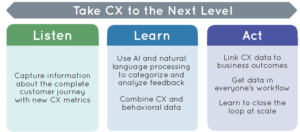
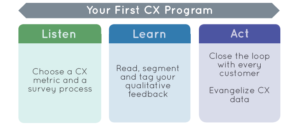
- Listen to your customers.
- Learn from your data.
- Act to optimize the customer experience.
As your business grows, you can expand your CX program with it. For now, however, you’re primed for the Early Stage option. So listen up; we’re going to get you started!
CX program fundamentals
CX programs center on Voice of the Customer (VoC) data — your customers’ feedback about their experiences and expectations for your products or services.
The key to a successful program lies in how you gather that feedback, how you process and learn from it, and then act on it.
This 3-step CX model is easy to understand, simple to get started and offers quick time to value.

Step 1: Listen
Listening starts with strategic thought:
- CX metric. What are you trying to learn?
- Survey process. How will you learn it?
Start by defining the goal of your CX program. Maybe your priority is to optimize your software product or to improve the support experience. Knowing what you want to learn will inform your listening strategy.
Have your goal set? Onward!
Begin With Net Promoter Score (NPS)
It’s time to ask your customers some essential questions. We’ve bid good riddance to long, multi-question surveys. Because they’re tedious, their completion rates are dismal.
To get customers to give you actionable feedback, you’ll want to use micro surveys. These single-question surveys:
- Give you a score (aka metrics!) on customer loyalty or satisfaction.
- Give you deep insight by inviting the customer to explain their score in their own words.
Because micro surveys are short, sweet, and to the point, more customers will answer them, meaning your response rates will soar.
There are three core CX surveys you should have in your toolbox:
- Net Promoter Score (NPS)
- Customer Effort Score (CES)
- Customer Satisfaction Score (CSAT)
For your first customer survey, we recommend you begin with NPS. Net Promoter Score is the gold standard for measuring customer loyalty and will give you immediate insight into your customers’ stories.
Once you and your CX program have grown, you’ll likely need other survey types. But Early Stage programs can find out what they need to know with these three.
Choose Your First Survey Channel
Alright, your question is at the ready. Now you need to decide how you will survey your customers. Each segment of your customer base probably has a preferred method of communication. Common options include:
- email surveys
- in-app surveys inside a web or mobile product
- SMS
If you’re unsure where to start, ask yourself this: Where here are our most important customers interacting with us?
If you’re still not sure, dive into this article about how to choose the best channel for customer feedback survey. Here are some general trends we see with our customers:
- SaaS business or mobile app: in-product survey
- E-commerce business: transactional approach like sending an email survey a few days after delivery
- Airline or utility (or other business already using texts or phone calls to communicate on customer mobile devices): SMS
Next comes the question of when to survey. Keep it simple. Ask NPS 30 days after a customer onboards, or whenever they will have had enough time to form an opinion about the experience you offer. The surveys are something you can “set and forget” and then just let the feedback roll in. A CX platform will survey a few users every day, so you have constant feedback coming in. Some platforms (like Wootric) offer a free plan for early stage businesses.
Step 2: Learn
Here’s where things get exciting because your customer feedback is coming in!
The great thing about Early Stage is you can read and respond to every survey response. This will help you stay closer to the customer and develop a holistic view of your customer experience.
There are an art and a science to the Learn step that will allow you to take hundreds of pieces of feedback and make it actionable. To do that, you need to get busy.
Segment Your CX Data
Even if your company provides only one service or product, your customers are not all the same. Categories of users have different needs and are bound to experience your company in slightly different ways.
You’ve given the same NPS survey to all your customers. Your overall NPS score will let you know how you’re doing across every customer. However, your customers aren’t just one block of users. Our marketplace customers like GrubHub and Deliveroo have both consumers and restaurant owners using their app, and those two groups have different needs. By segmenting NPS, you’ll receive more actionable insights to optimize your product for the various user groups.
Take our customer Homebase. They have two user groups for their SaaS product that streamlines employee scheduling: those who create schedules and those who receive schedules. Per CEO John Waldmann, “NPS has allowed us to segment out the feedback and look at how happy restaurant managers are with the product after the recent changes versus how happy the wait staff is. Are we skewing too heavily toward one side or the other? Do we need to spend some more product cycles to improve the employee experience?”
You can take a constant pulse of your CX program by reviewing the performance of your overall business and customer segment NPS scores over time. Tracking and metricizing customer sentiment over time is very helpful when you’re looking to make improvements. The bonus is you never miss a trend.
Identify Themes in Customer Comments
While it’s interesting to read and respond to individual feedback, at some point, you will get more qualitative feedback than you can easily digest. Lots of feedback is a good thing — it means you’re growing!
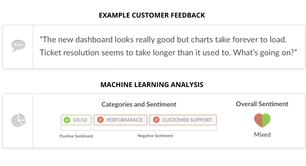
Now’s the time to filter your text responses to understand the “why” behind the numerical scores. You’ll filter these responses for specific topics by using tags. Tags are associated with particular keywords you want to monitor, and they allow you to easily track the Share of Voice (SoV) of a topic. How much are people talking about price, performance, delivery, or a new feature?
Setting up this categorization does a lot of things:
- It helps you follow long-term trends.
- It gives you insight into a topic’s trajectory.
- It lets you know if you’re addressing your customer’s concerns effectively — or you still need to do more.
Step 3: Act
You’ve listened, you’ve learned, and now it’s time to make a difference by acting externally and internally!
Close the loop with customers
Every piece of feedback is valuable. While you’re hoping for promoters telling you what a great job you’re doing, it’s the detractors who care enough to let you know what needs improvement that can help you make the most significant business gains through your CX program.
Close the loop, especially with detractors!
Reach out via email or phone and address their concerns promptly. Passing your CX data to the system, you use to communicate with customers — like Intercom or Hubspot — can make this easy. Customers will appreciate that you took the time to listen and respond. You may even turn a detractor into a happy customer.
Activate your brand promoters. When someone gives you praise in a survey response, ask them to write a review or give you a quote. These testimonials can be great ways to distinguish your brand from the competition.
If you don’t have the resources to respond individually, write a blog post that summarizes what you’ve heard and the actions you’re taking and share it with your customers.
Loop closing in practice
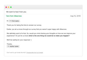
You may be thinking, “this sounds great in theory, but that’s a lot to expect from a new program.” Understood. Many people in the Early Stage of CX programs are also in their company’s early stage, with too much work and too few people. Our customer Albacross, a lead-gen software startup, automated closing the loop with its customers, which achieved program goals without taxing their resources.
Here’s what they do based on the individual NPS score:
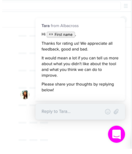
Detractors (who rate their app low with a 0-6): They send two messages via Intercom asking for additional feedback. The goal here is to start a conversation and better understand why the customer is frustrated.

- They send an in-app message that appears immediately after the user completes the survey:

Passives (who rate 7-8) receive an in-app email of gratitude, letting them know they appreciate the feedback.

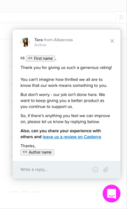
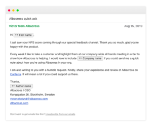
Promoters (who rate 9-10) receive an email from the CEO offering gratitude and asking them to please review the company on a 3rd party review site:

Evangelize CX data
You are trying to build a customer-first culture at your company. To do that, you need to communicate, communicate, communicate.
Make sure everyone has easy access to CX information! From Customer Success and Customer Support to Product to Marketing and beyond, every person in your company has a part in creating your customer experience. Create a CX Slack channel and encourage the entire company to join. Put up wall-mounted dashboards that put CX metrics front and center with the newest feedback and the latest scores — report it right next to other critical business metrics at the next company-wide meeting.
A single survey on a single channel offers significant customer insights. Like any new program, you want to start simply, optimize, and then expand. Once you have mastered the Early Stage program, it’s easy to move on to the Growth Stage and Expert Stage.

